The intranet homepage is the window into your entire site. It’s the first thing staff see when they log in and kickstarts the working day. You want the homepage to capture their imaginations and showcase all the apps and tools employees need. Get it right, and your people will keep coming back for more. Get it wrong, and your intranet software will struggle to gain traction.
Intranet homepage design is the key to unlocking employee experience and user adoption. The stakes are high. And there’s a lot to think about. You have to make decisions about intranet design, functions, and employee needs.
However, help is at hand with our best practice guide. Use our expert tips to ensure your organization has a great intranet homepage that adds value. Today’s post is essential reading whether you are designing a new intranet or planning an intranet redesign. We finish by exploring some intranet design examples to motivate and inspire you.
What Is The Purpose Of The Company Intranet?
Before you dive into your intranet homepage design, there’s an important question you need to ask: What is the purpose of my company’s intranet?
No two company intranets are exactly the same. Sure, there are common elements, but much depends on the intranet’s purpose. A clear understanding of objectives will help you nail the design. It’s tempting to include a bit of everything on the company homepage. Drilling down into what’s really important ensures your intranet adds value and meets employees’ needs.
Say your primary purpose is internal communications and employee engagement. Social features, company news, and employee profiles will be center stage on the intranet homepage.
However, if you want the intranet to facilitate collaboration, the homepage will have a different look. Collaboration tools that connect employees will be in the spotlight.
Once your primary objectives are locked in, the design process falls into place much easier.
What Is An Intranet Landing Page?
The intranet homepage is what employees see when they log in. And it has a lot of power, making it a business-critical tool. It serves a range of purposes, including the following:
Gateway To The Digital Workplace
Intranet homepages are the gateway to all the enterprise apps and tools employees access daily. Single sign-on means your intranet integrates with other workplace platforms like Microsoft 365, Google Workspace, and Salesforce. And it’s also the central hub for finding internal knowledge and information.
Company News Feed
It’s also where staff go to find out the latest company news. Critical news alerts and important announcements are usually showcased on the intranet homepage.
Intranet Navigation
The homepage serves as a navigation hub for the entire site. A global navigation bar and search function helps employees find key information quickly and easily.
Intranet Content
It’s a springboard to internal knowledge, information, and tools, whether corporate, team, or department based.
Widget Launch Pad
Widgets are handy shortcuts providing access to the most popular information or features. However, too many widgets can overwhelm users. Stick to top-performing intranet content. Or consider aggregating widgets by themes, like news alerts or notifications.
Build Your Employer Brand
Just as your website is the company’s public face, your intranet is the internal version. Intranet homepages go a long way to determining your employer brand and setting the user experience. Be sure to include your company logo so the intranet design is instantly recognizable as part of your brand.
What’s The Best Intranet Homepage Design?
While there’s no one-size-fits-all intranet homepage, there are some guiding principles that all the best designs have in spades. Use the following tips to guide your intranet design.
Simplicity
Keep it simple. When it comes to intranet design, simplicity is your best friend. Make it clean, straightforward, and uncluttered. That way, you enable employees to find what they need when they need it.
Consistency
Just as important is consistency. A consistent page layout from the homepage right through to team pages keeps employees engaged. They know what to expect, creating an enhanced user experience. Plus, intranet navigation is more straightforward when pages have a similar look and feel.
Signposting And Navigation
The intranet homepage is the launching pad for the digital workplace. However, employees are looking for quick access to the tools they need the most. Mega menus and quick links to relevant content are valuable navigation tools. Use them to point people in the direction of more resources. Incorporate advanced search features and display the intranet search function prominently.
Inspiring Visual Design
Your homepage design should draw employees in with an eye-catching visual display. Why not have a media gallery with images of staff? Don’t be afraid to use vibrant colors and mixed media like videos, photos, and diagrams. Text-heavy content can turn users off, so mix it up with bright visuals.
Mobile Intranet
In today’s digital workplace, a mobile intranet is mission-critical. Remote and hybrid working are now standard. You want to ensure your staff can use their mobile devices to access the intranet. So, regardless of the employee’s location, they can maintain productivity.
Nowadays, your intranet homepage must be mobile-responsive if you want to boost productivity for all workers. Test drive your intranet homepage on a mobile device before you go live.
What Should Be On The Homepage Of A Company Intranet?
The details will vary depending on the organization and the objectives set for the company intranet. Regardless, there are some must-haves that every company homepage needs to drive employee engagement while addressing business problems.
Empower employees by giving them quick access to the business processes that affect them the most. These include the following:
- Quick links to popular apps and tools
- Staff directory
- Social intranet
- Training materials
- Company news feed and team updates
- Collaboration tools
- Feedback form
- Internal communications, including instant messaging
- Robust search engine
How Do I Set Up An Intranet Homepage?
Setting up an intranet homepage can be done in several ways, depending on your platform and the tools you use.
You can design a company intranet using software like SharePoint Online or WordPress. These options are readily accessible and free to download. Although that’s tempting, it’s vital that you do your research. Many average users find SharePoint Online and WordPress tricky to work with. Getting the most out of the software requires technical skills. Furthermore, many companies find the free offering has to be supplemented with add-ons and plug-ins. Often, these come with a price tag.
Alternatively, providers like MyHub use customizable intranet templates. Upload content, visuals, and videos with these easy-to-use templates. The basic layout is already there, just waiting for you to put your unique stamp. Templates make the intranet design process more straightforward. Even better, you don’t need any great technical know-how.
Furthermore, these templates are tried and tested for mobile devices. They also come with advanced search functions. And the provider takes care of any security concerns about company data with the latest online security features.
Most providers offer free demos or trial offers. Take advantage of these opportunities. It’s your chance to explore the intranet software in action before committing.
Check out MyHub’s step-by-step guide to creating an intranet for more tips.
What Are Examples Of Intranet Homepages?
We’ve discussed all the basic building blocks. Now’s the time to put it all together. The following intranet design examples showcase all these features in our best intranet homepage selection. Share these inspiring intranet examples with your design team.
Intranet Homepage Example #1
This intranet homepage is a perfect example of how to nail the design. The striking feature is the vibrant, uplifting image that immediately captures your attention. The vivid colors and happy faces create an instant impact and encourage employees to dig deeper.
The homepage also features a concise mission statement. Employees clearly understand the intranet’s purpose and what to expect from the site.
Furthermore, the navigation bar showcases quick links for maximum visibility and easy access. The emphasis on high-level tabs makes for a straightforward, intuitive user experience.
The homepage sets the site’s tone and establishes user expectations. This example demonstrates how a minimalist, visually captivating intranet design can leave a lasting impact.
Main Takeaways
- Embrace simplicity. A no-fuss intranet design makes it easy for your people to find what they need.
- A visual design is compelling. It captures users’ attention in such a way that encourages employees to explore further.
- Power up employee engagement by prioritizing the user experience. Improve information discovery with visible navigation and quick access to the most popular features.
Intranet Homepage Example #2
When it comes to effective intranet design, the golden rule is that less is more. And this example shows how compelling a simple intranet homepage design can be.
The vibrant banner image has excellent visual appeal. And it also sums up what the company is all about. This photo works so well because it’s closely related to the content.
In this example, the company intranet is named “The Hub.” Naming the intranet brings it to life and makes clear the site’s purpose.
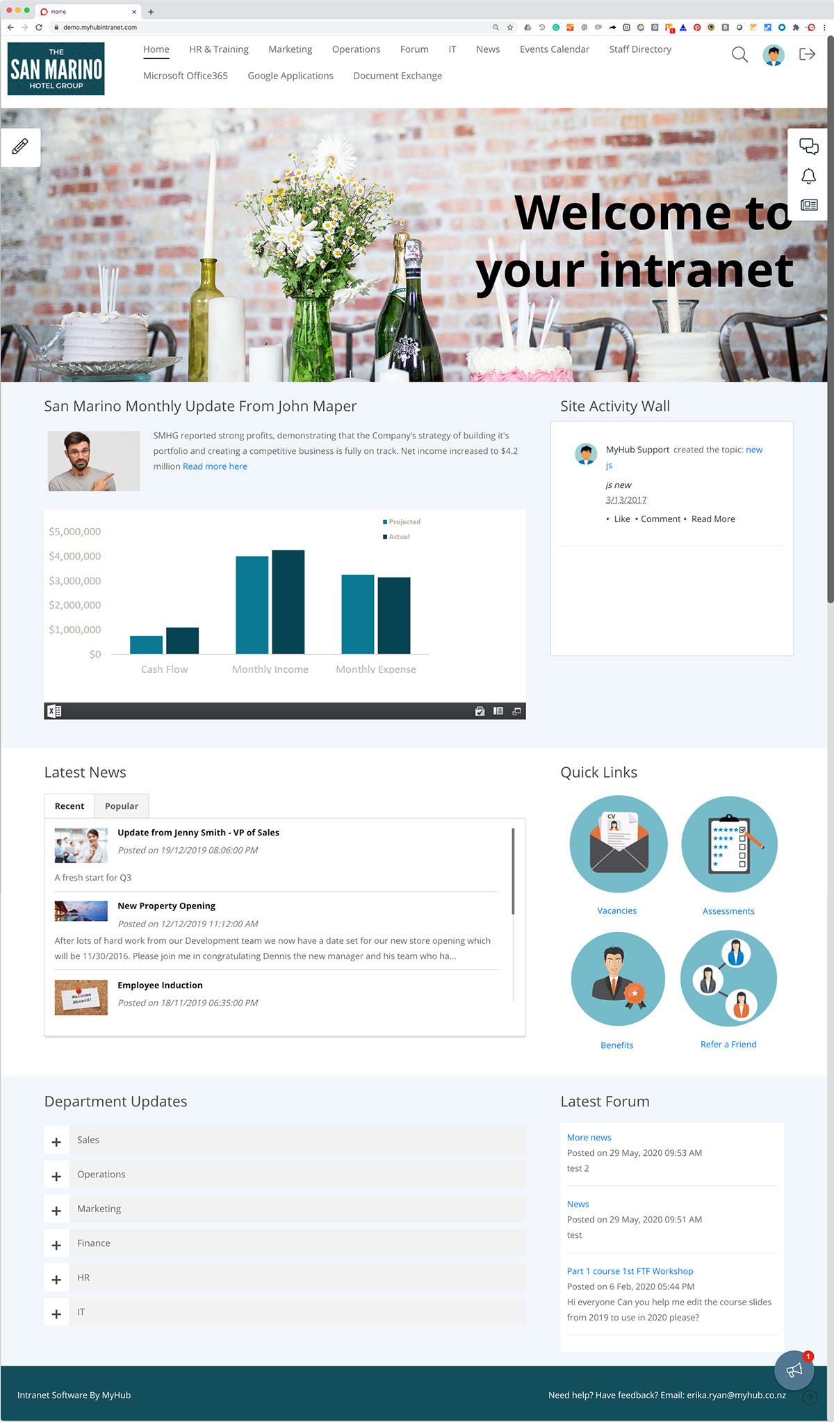
This example features responsive column-based layouts. Quick links are highlighted with a visual button. And navigation links delve deeper into departments and information areas. Internal communications are boosted with a prominent “Latest News” widget followed by departmental updates.
Main Takeaways
- Consistent page layouts and color palettes work best in intranet design. You want to achieve a cohesive look for the entire intranet. This example uses a neutral palette of blues and grays. However, an eye-catching injection of color comes from the banner image and icons.
- Make news headlines and quick links center stage. This example uses engaging icons. You can also select tabs or mega menus.
- Give your intranet a name. That way, you will create a unifying identity. Why not involve employees by suggesting names and getting staff to buy into your new intranet?
Bonus Intranet Homepage Designs
Check out MyHub’s 19 Intranet Design Examples for more ideas. Here’s a handy summary of other options to explore.
Personalized Intranet Homepage
The ultimate in user experience, this gives control to the employee. Usage data, including permissions, notifications, location, and follows, ensures the homepage is tailored to the individual user. Quick links, news feeds, and alerts reflect the employee’s role, location, and preferences.
Operational Intranet Design
Here the emphasis is on getting stuff done. Features relevant to daily operations are highlighted on the homepage, including collaboration tools, project updates, and a data dashboard.
Information Discovery Intranet Homepage
This intranet design puts findability at the forefront. Employees are empowered to source information and find answers using a self-service approach. Drop-down menus, icons, and a prominent search help workers locate what they need in just a few clicks.
Best Intranet Homepage Design: Quick Summary
We’ve covered a lot of ground in today’s post, so here’s a handy summary. Use these tips to guide the development of your new intranet. These principles are also helpful if you are revamping an existing platform.
Set Your Intranet’s Objectives
Be clear about what the company intranet needs to achieve. Those objectives will be reflected in your intranet design.
Be Consistent And Keep It Simple
All the best intranets have a simple, uncluttered look. However, that doesn’t come at the expense of features. All the tools staff need are center stage. And remember to highlight the intranet search.
Visual Appeal
Text-heavy intranet homepages are a turn off for many. Attention-grabbing colors, images, and videos entice employees to dig deeper.
Mobile Friendly
A dedicated mobile app should be your preference. However, if that’s not possible, test the homepage design on mobile devices.
About MyHub
We are a leading provider of cloud-hosted intranet platforms. Consistently rated highly on independent review sites, companies of all shapes and sizes use our software. We make intranet design easy. Find out more with a free demo or no-obligation 14-day trial.


0 Comments