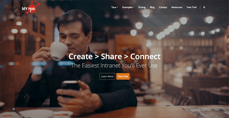
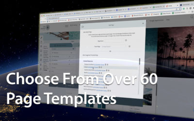
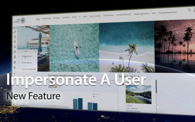
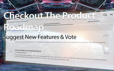
It’s hard to believe that we’re on version three of our website since we rebranded as MyHub version two a year ago. Why the change? We got some great feedback from clients about how they wanted to see more screenshots and what could be achieved without the need to sign up for a trial. So, whilst it would have been easy to put a load of screen shots and screen capture video up with a monotone voice over, this would have been a little boring. We also considered the right tone of voice as we wanted it to be informal and a little cheeky as this aligns with what we’re all about. With so many features we didn’t want to have pages and pages of the usual features and benefit statements either so it had to be clear and concise and use the latest design elements and tools, in short be more visual and engaging. So taking all that into consideration we’ve gone for a flat design site using a number of plugins as we didn’t want it to take ages to build and launch and we wanted to do it in-house. The use of video on the home screen (we call him coffee guy), screen shots displayed on raised card, scenario-based animated video and testimonials are great ways to connect with people and show them how MyHub will work for them.
So, three sites in one year, it’s all part of what we call listen-apply-evolve, it’s what drives us and it’s great fun too.
We hope you enjoy the new site, let us know your thoughts and ideas.
0 Comments