25 Intranet Examples To Help You Design Your Site
Looking for some intranet design inspiration? Check out our best practices and company intranet examples below. From homepages through to directories, there are plenty of intranet examples to get you started.
The design of your new intranet is the difference between success and failure. An engaging, user-friendly design will see your people eagerly logging on, encouraging employees to take full advantage of all the great features. However, a poor design will leave staff frustrated and switching off. Even worse, it could see employees seeking alternative tech solutions.
Real Company Intranet Solutions: Inspiring Examples to Consider
So, what does a well-designed intranet look like? Check out the following 25 best practice company intranet examples.
- Homepage Example 1
- Homepage Example 2
- Intranet Template Example
- Employee Directory
- User Profile Intranet Examples
- File Sharing Example
- Accordions / Expanding Text Example
- Mobile-Responsive Example
- Forms / Workflow Example
- Embedding Documents
- Employee Engagement Form Example
- Chat Example
- SSO (Single Sign On) Example
- Custom CSS Example
- Notifications Example
- Site Map Example
- Administration Example
- Video Example
- Mobile-First Intranet Example
- Organization Chart Example
- Integrations Example
- News Example
- Employee Handbook Example
- Events Calendar Example
- Department Page Example
1. Homepage Example 1
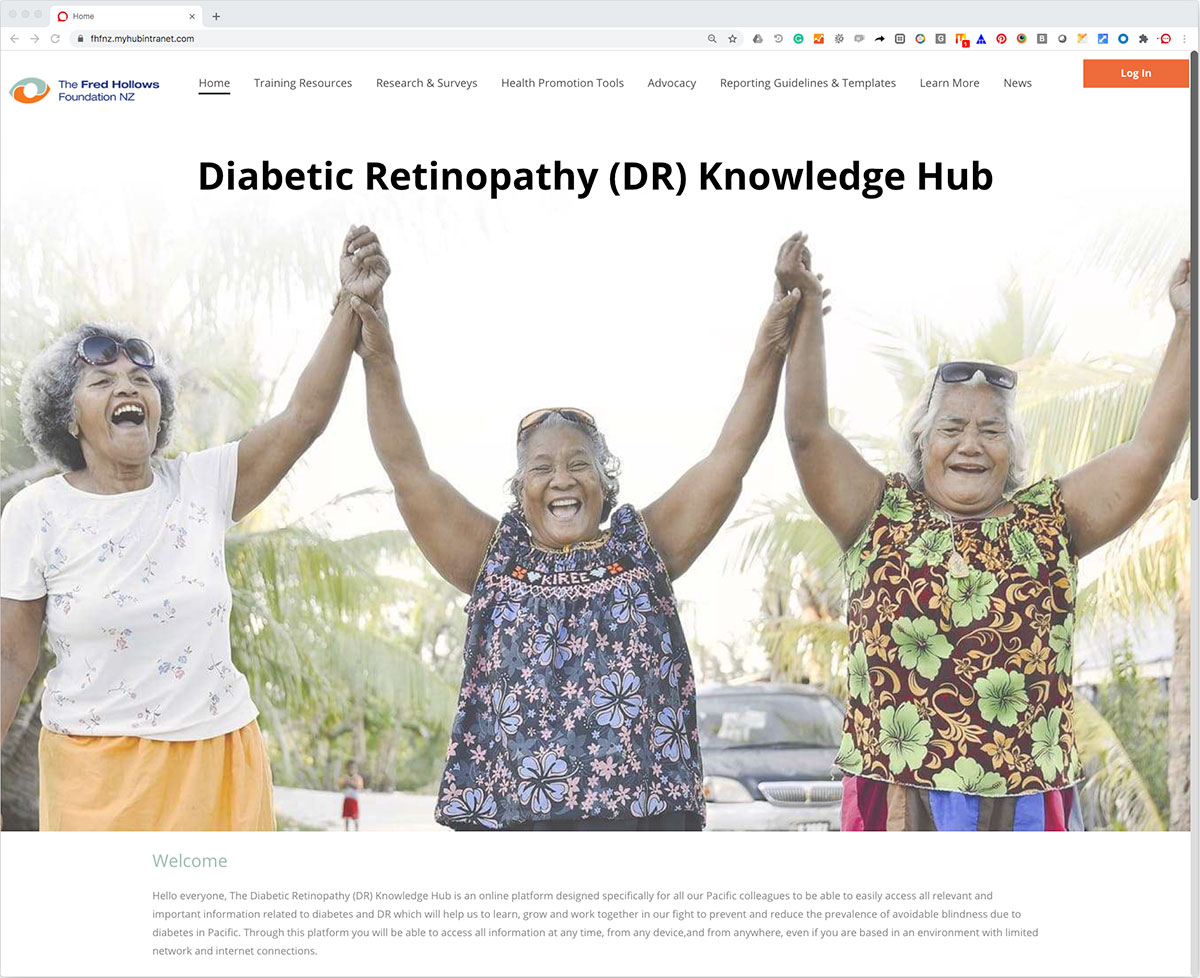
This intranet homepage is a fantastic example of how it should be done.
The first thing that hits you is the happy, joyful image. Colorful and bright, it has an immediate impact and draws you into the site. People enjoy seeing images of real people, so this photo ticks all the boxes and will engage employees.
The homepage also has a brief mission statement. It sets out what the company intranet is all about so the user is clear what’s in store.
In this example, navigation links are highly visible, easily accessible, and are kept to a minimum. Only the critical high-level tabs are shown. It’s intuitive and easy to follow. The user instinctively knows they can click the link for more detailed information.
The homepage sets the tone and expectations for the whole site. This example shows how a minimalist, highly visual page has maximum impact.
Main Highlights
-
An inspiring visual design has an immediate impact. The user is drawn in and is invited to explore further.
-
Focus on user experience. Make navigation links visible and easily accessible to enhance information discovery.
-
The navigation tabs make access to all content and resources easy. Users click on a tab to open a full menu of options.
-
Keep it simple. When it comes to a good company intranet, less is often more. Aim for a no-fuss, minimalist design that makes it easy for employees to find what they need.
2. Homepage Example 2
All the best-of-breed corporate intranets have a simple, uncluttered look that is easy on the eye. Packing too much in with lots of text and images makes for a confusing user experience. And it’s harder for employees to work out what’s important and find what they need. For maximum effect, the golden rule is to keep it simple.
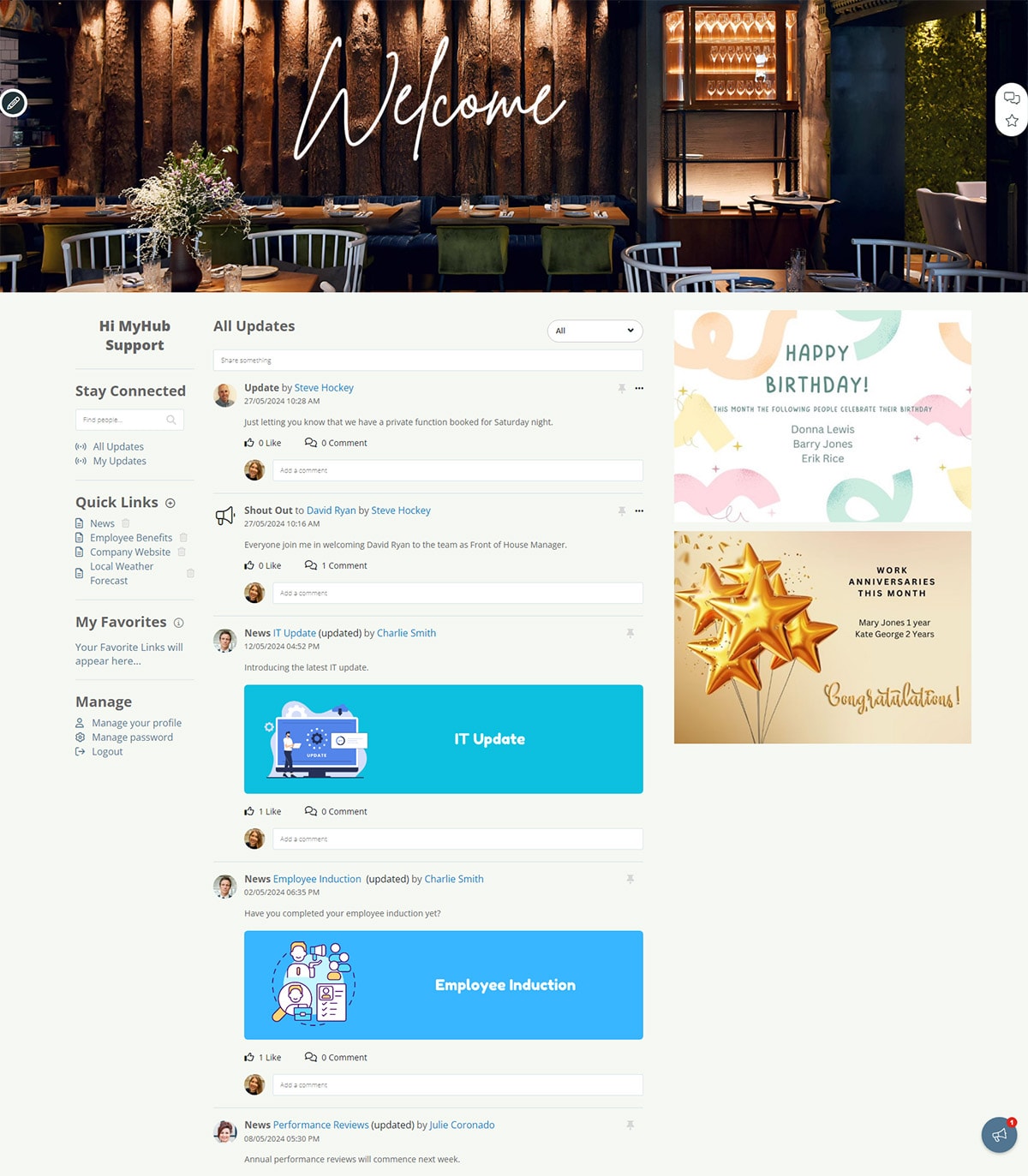
The second example highlights MyHub’s new updates feed, bringing together company news and alerts from across the site. It could include employee recognition shoutouts, all-staff bulletins, or an internal job board.
Furthermore, clear navigation links offer easy access to personalized favorites and quick links, ensuring workers find what they need quickly. The box layout style delineates the key information items.
Workplace anniversaries and birthdays are also highlighted to boost employee morale.
Main Highlights
-
Use a consistent page layout and neutral color palette. This will give your intranet a cohesive look and feel.
-
Provide ready access on the homepage to popular tools and content. This example has identified quick links and favorites.
-
The updates feed ensures staff don’t miss vital company announcements. Aim to include a mix of team and corporate news for a personalized employee experience.
-
Consider naming your intranet. Doing so gives the intranet an identity and can help convey the company’s vision and values. Get the workforce involved in choosing a name to boost staff buy-in and adoption rates.
3. Intranet Template Example
Intranet templates make the design process a whole lot easier. They are the perfect solution if you’re short on time or lack confidence in your technical ability.
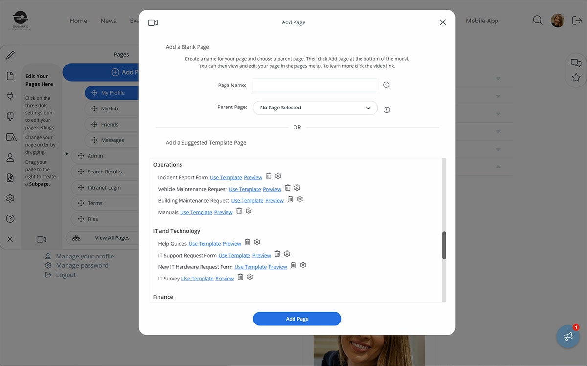
Pre-built by the provider, intranet templates come loaded with coding, functionality, and a basic design. You can pick and choose from various templates appropriate to your organization’s needs. Highlighted in this example is one of the wide range of choices available.
Once you have selected a design template, it’s time to customize. You can use the built-in graphics and layout or play around with the template to create a unique solution. Upload photos or images relevant to your business. And change the colors and font to reflect your corporate style.
Specially designed by experts with non-experts in mind, intranet templates are easy to use. And they are a great time-saver, which means you could be reaping the rewards of the intranet website all the sooner.
Main Highlights
-
Fully customizable intranet templates save time and hassle.
-
Select from a wide range of options to develop a unique solution relevant to your business.
-
Use the in-built graphics and layout or adapt the template and upload your own images. The choice is yours.
-
Tried and tested, intranet templates mean you can be up and running in no time. Even better, you don’t need to be a tech guru.
4. Employee Directory
An employee directory connects your people across the organization, including remote or on-the-go workers. It’s a simple but effective tool for improving employee communication and collaboration and promoting a friendlier, more inclusive company culture.
It’s also a popular tool for new employees, and many companies have made it part of the onboarding process. New team members will be grateful they won’t have to remember every colleague’s name and job title from day one. It’s also a vital lifeline for remote employees. They can connect with their colleagues formally and, perhaps more importantly, informally. You may find the team chat becomes the new water cooler.
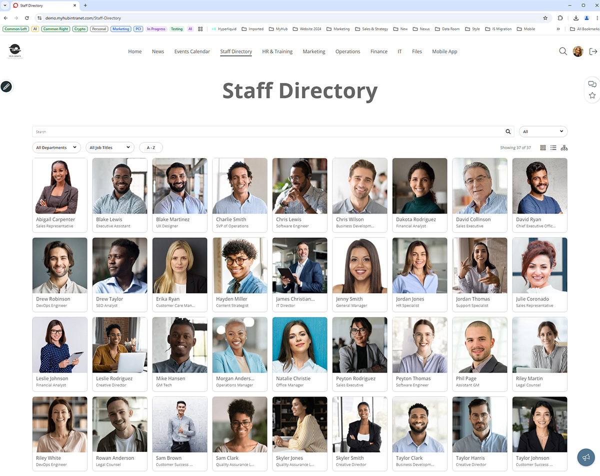
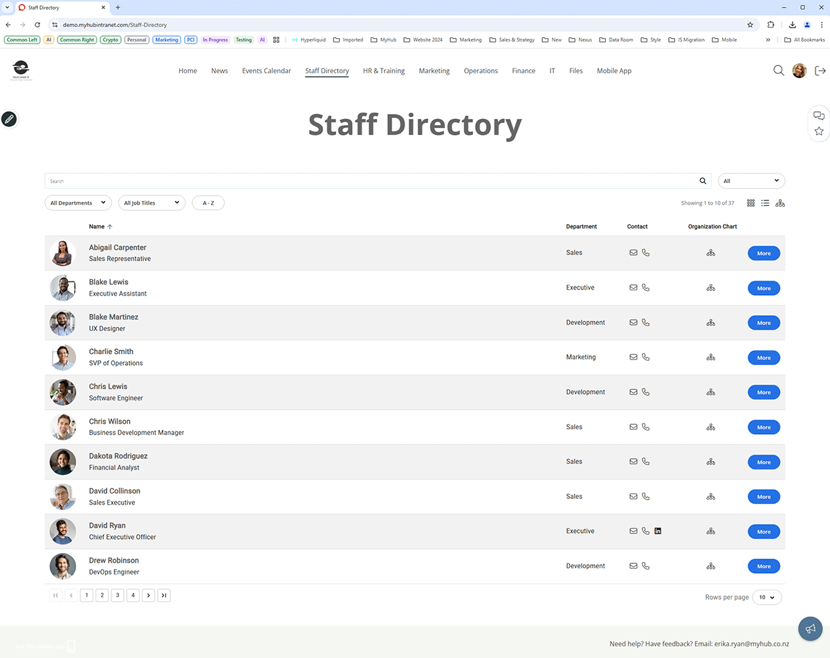
This employee directory example features two views: a list or a tile version. The tile version has bright, colorful headshots, and employees can click on the photo for more information. The list view includes basic contact details plus an option to click for more detail.
Workers can search for colleagues by department, job title, or the A to Z tab. Employee profiles differ from company to company but often include areas of expertise and current projects. You can even adapt the template and introduce custom fields as appropriate.
Main Highlights
-
Staff directories bring workers together regardless of location.
-
Advanced search makes it easy for workers to find colleagues. Search results can be filtered by job title, department, or A to Z.
-
Consider incorporating a real-time team chat feature. Intranet-based IM streamlines collaboration, connects distributed teams, and speeds up decision-making.
-
Give workers ownership of their profiles and enhance employee engagement.
5. User Profile Intranet Examples
When it comes to key intranet features, user profile pages are a must-have. They are invaluable for introducing employees to each other – great news for new hires, especially.
Many companies use employee profiles to promote joint work and collaboration. Allocating staff to corporate working groups is a whole lot easier with a handy summary of employees’ knowledge and experience.
Employee profiles give managers more oversight of the team’s collective skills. Leaders can identify gaps, plan knowledge sharing, talent scout, and prepare for succession planning.
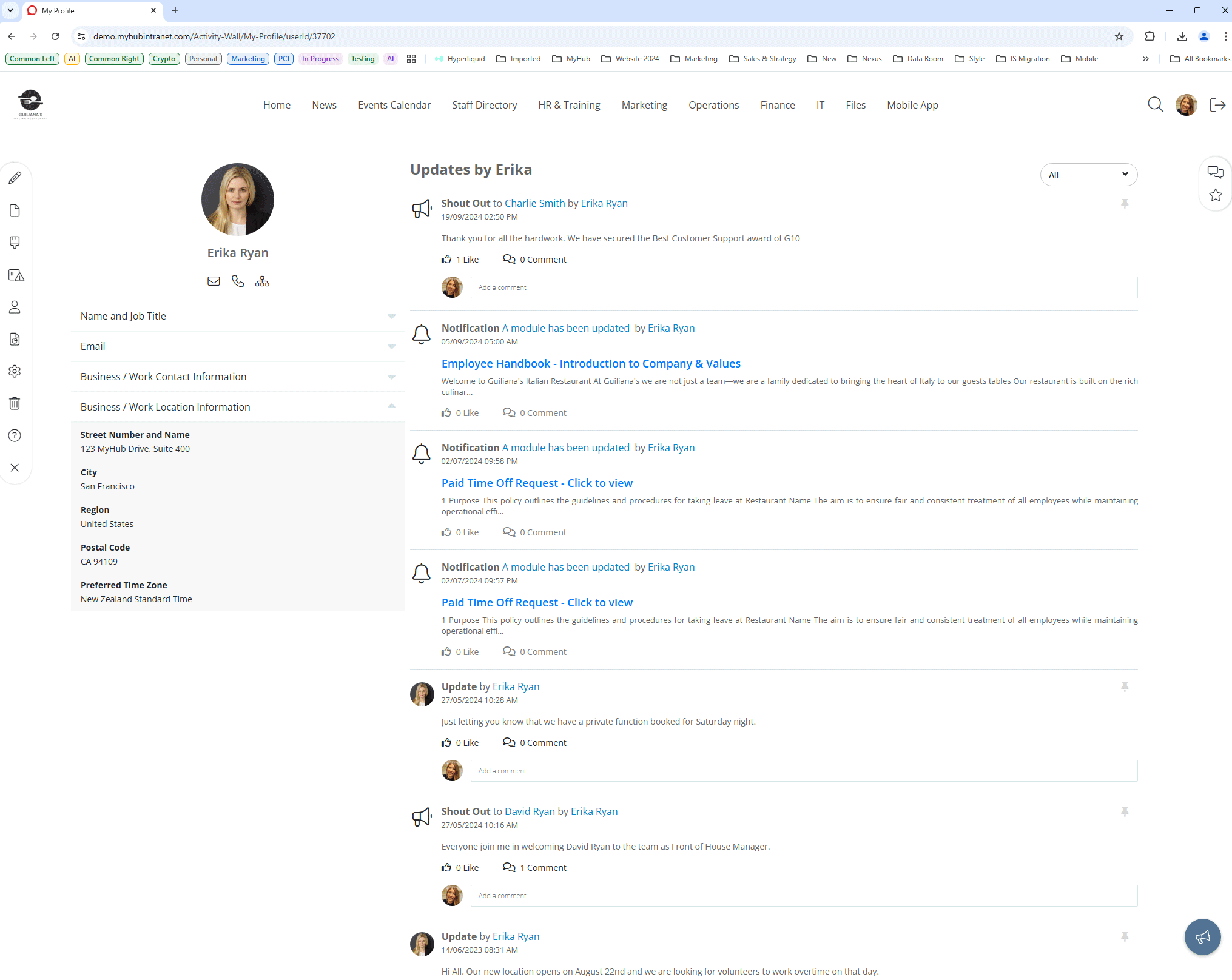
Some modern intranet solutions, like MyHub’s, allow you to create and use custom fields within the profile pages. In the example above, colleagues can see Ken’s recent activity on the site. Workers can also follow internal thought leaders, experts, and project managers.
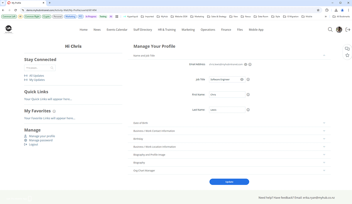
Employees self-manage their profiles, updating and refreshing the information as required. Giving control to workers in this way helps boost employee engagement. The example below illustrates some of the available custom options. Your people can update their photos, biographies, quick links, and my favorites.
Main Highlights
-
Employee profiles help workers get to know each other, especially new hires, during onboarding.
-
Use the employee profiles tool to support collaboration by showcasing workers’ experience and expert knowledge. Profiles allow managers to talent scout and provide better oversight of team-wide training and development needs.
-
Fun-to-use social intranet features such as follows, and @mentions bring employees together and promote social connections.
-
Utilize user profiles to support knowledge management and knowledge sharing.
6. File Sharing Example
Document management within your intranet portal can solve several problems. How often have you been asked by a colleague, “Where is the project file for this customer?” For many employees, navigating complicated folder structures is a pain. And from an organizational perspective, how much time is wasted searching for files and documents? The answer is probably too much.
Storing all company data and information on your company intranet means staff know exactly where to go. There’s no need to search long email trails or jam-packed shared drives. And there are no security concerns like there have been with some cloud file-sharing options.
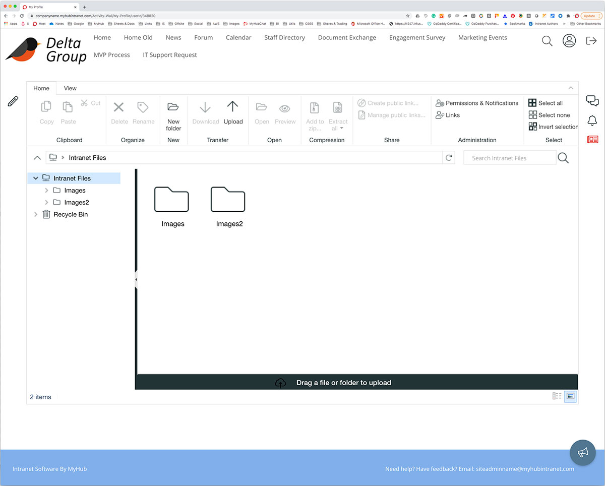
Employees can quickly and easily share files and documents internally and externally using the familiar file explorer interface. Furthermore, the intranet allows you to provide context around files by linking directly from pages.
Intranets deliver a more efficient exchange of information and data across the organization.
Main Highlights
-
The company intranet streamlines file sharing and information discovery.
-
Share files securely with internal or external contacts and take advantage of the bulk document upload and download tools.
-
A powerful search function ensures workers can locate what they need in next to no time.
-
Search filters should include tags, headlines, authors, and teams. And advanced search functions such as MyHub’s search results filtering allow for even more targeted searching. Results are filtered by file types, and you can eliminate unwanted types by ticking the box.
7. Accordions / Expanding Text Example
Accordions or expanding text modules are excellent for presenting a lot of information on a single page. However, be careful. Some solutions load all the content in one go, slowing page load times and frustrating users.
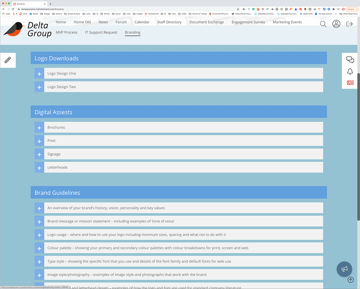
Below is a great example of how to do it. There are two columns with different sections for each product area. The information in each expanding text area doesn’t load until the user clicks the chosen product.
Accordions and expanding text are perfect for mobile intranets. They work much better than mega menus on the smaller screen format.
Main Highlights
-
Accordions and expanding text options help you convey more information in less space.
-
Content is hidden from the team member until they click, and an expandable menu appears.
-
Use colors and different fonts and font sizes to distinguish the main headings from sub-headings.
-
This feature is handy for mobile intranets with their smaller screens and touch functionality.
8. Mobile-Responsive Example
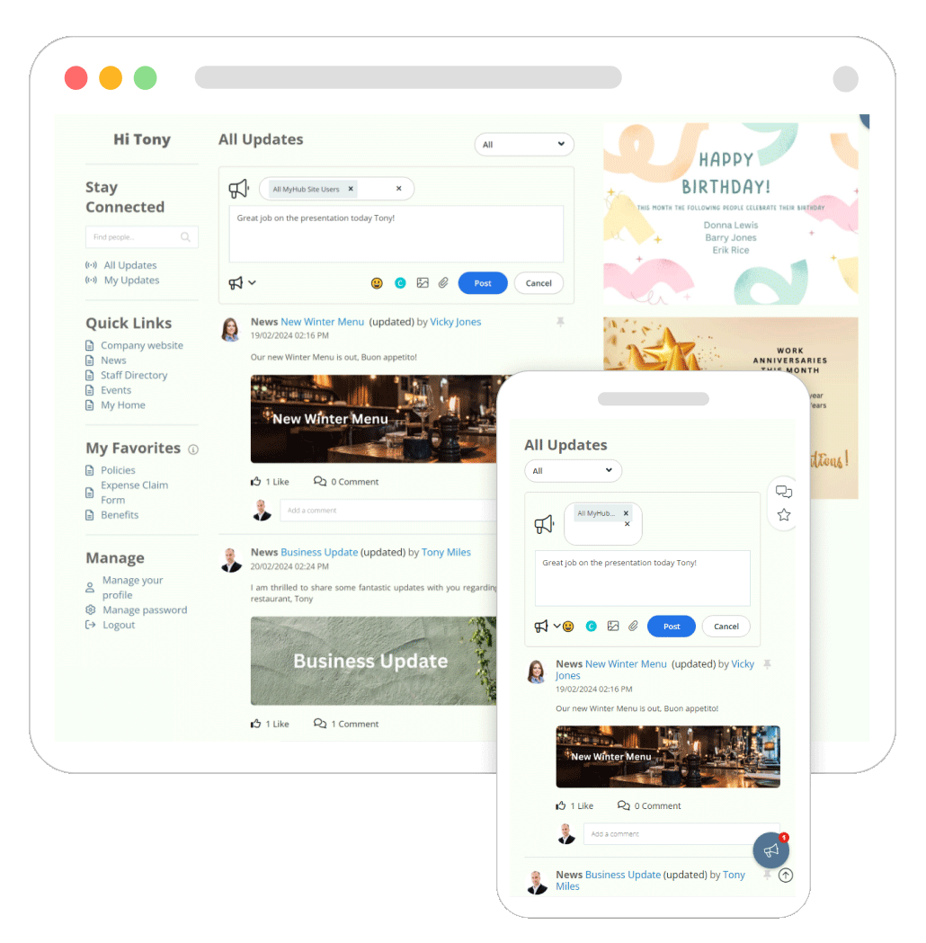
The example below shows the home page from example two and how it responds to different device types and orientations. Nowadays, it’s essential to have a mobile-responsive intranet or, even better, a specialized mobile app. Remote employees and those on the move benefit from the improved processes and communications your intranet brings. Mobile intranets are mission-critical when it comes to employee productivity, whatever their location.
It’s essential to carefully consider how content will translate to the smaller screens of smartphones and tablets. For example, the intranet’s typeface, font size, and color scheme may appear differently on mobiles.
Having an uncluttered look that’s easy to find your way around is even more critical. Employees shouldn’t have to work hard to read the text or locate information, so be careful in your design choices. Piloting your company intranet before going live is always a good idea. A practice run means you can check how well the content works from a mobile perspective.
Main Highlights
-
Intranet designs look and work differently on mobile devices.
-
Test drive your mobile intranet project before going live to ensure it’s fit for purpose.
-
Don’t try to pack too much into a mobile intranet. Keep navigation short and sweet, focusing on the essential tools and features. Make sure buttons and menus are finger-friendly.
-
Be mindful of font sizes and color schemes so that content is easy to find and read on smaller screens.
9. Forms / Workflow Example
We all know that paper-based or emailed forms can be a headache. Information can easily get lost, or errors can creep in, causing the form to go backward and forward.
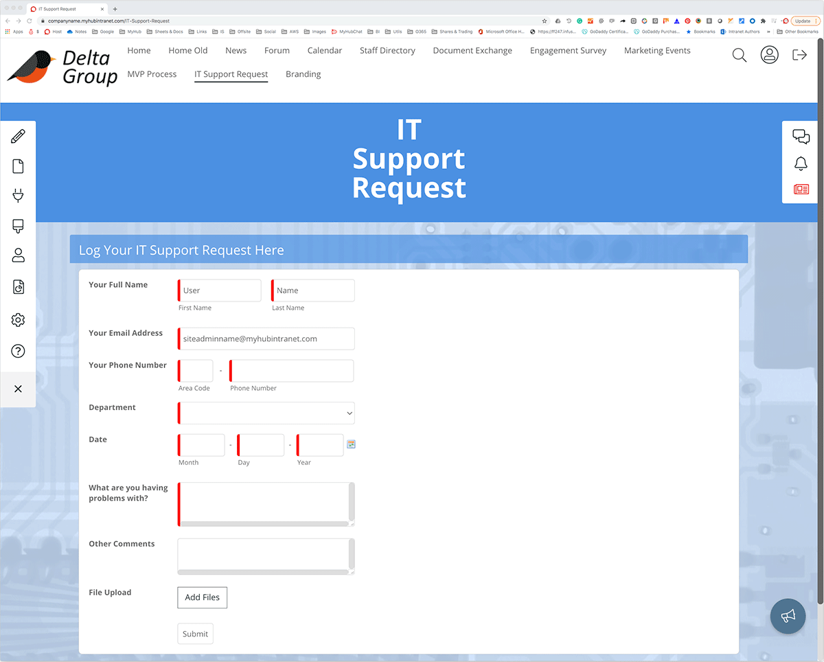
This example shows how you can group forms in a single area on your intranet portal, providing easy online access. The example below is in IT. However, it could be HR forms or approvals – the choice is yours. Many companies have set up an onboarding section to make life easier for new employees. New staff need to complete several forms, and a central resource streamlines the onboarding process.
You can use the intranet’s intuitive forms builder to set up workflow processes. Alternatively, you can use an embedded Google Workspace or Microsoft 365 app. With simple drag-and-drop fields, create a fully customizable form and automate your business processes. Forms are automatically routed to the relevant department for action, and managers have more oversight of where things are and any bottlenecks.
Furthermore, online forms mean staff have 24/7 access. This is critical for remote and non-desk staff. And it’s a big tick for businesses looking to be greener and reduce their paper consumption.
Main Highlights
-
Streamline approvals and business processes with digital workflows. Faster and more accurate, automated workflows make life simpler.
-
Create customized forms using the intranet’s easy forms builder with drag-and-drop fields.
-
Alternatively, use embedded Google Workspace or Microsoft 365 apps to create forms.
-
Give your green credentials a boost by doing away with paper-based systems or complicated email processes.
10. Embedding Documents
Embedding Google Docs or Microsoft 365 cloud files directly in your company intranet provides a powerful solution to several business problems. Page permissions mean you can easily restrict access with your existing cloud-solution permissions.
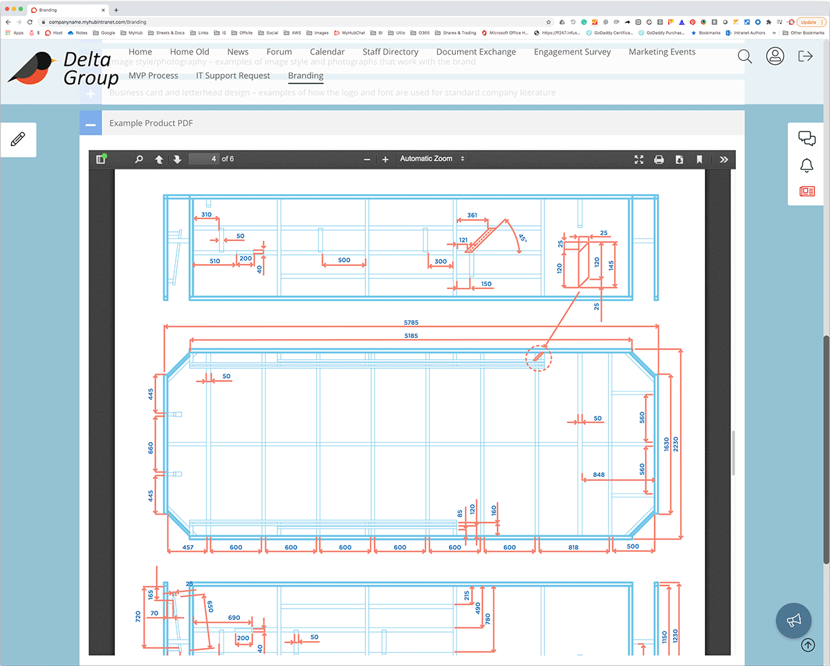
The example below shows an embedded Excel spreadsheet. Not all of your users require access to edit the spreadsheet data directly. Embedding the spreadsheet within your company intranet means the user has a live view of data entered without having to find the file. This also opens up a whole range of options. You can provide explanatory notes or training information on the page as well.
Say your business has a weekly sales spreadsheet. An intranet-embedded Excel or a Google Sheet allows multiple users to access and edit the data simultaneously. Updates are made in real-time, and the intranet automatically saves the information. Explanatory notes about completing the spreadsheet and why the information is required can be displayed. Management can be confident that the company intranet has the latest sales data.
Furthermore, working on a corporate-wide strategy is simplified. For example, the annual report usually requires several authors and the input of many departments. An intranet-embedded Google or MS doc means you can do away with emailed versions that are hard to track. A live version is readily available to relevant users. It’s a more straightforward and effective way of getting things done.
Main Highlights
-
Harness the power of Google and Microsoft in one platform with universal access for all staff.
-
Embed Google Workspace or Microsoft 365 apps directly in the company intranet for live data sharing and real-time collaboration.
-
Restrict access to relevant employees only using the intranet’s page permissions feature.
-
Do away with complicated track changes and emailed versions of documents.
11. Employee Engagement Form Example
Want to know about employee satisfaction within your organization? There’s only one way to find out – ask them.
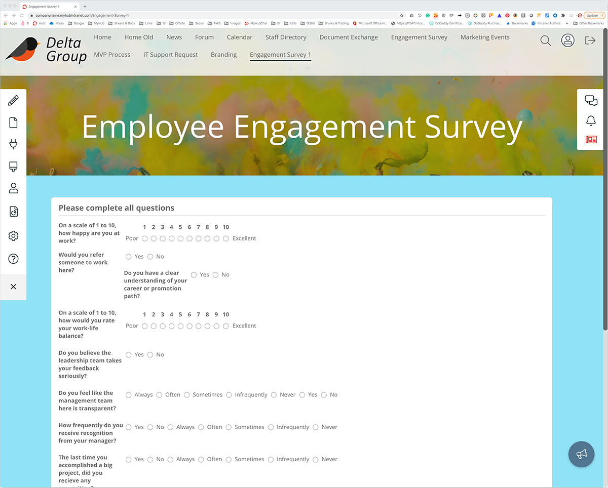
Employee engagement surveys help you identify areas for improvement. And the modern intranet means you don’t have to employ expensive consultants to get started. Use the intranet’s forms builder to create your own employee engagement surveys.
It could be a snapshot survey to gauge opinion on a particular issue or initiative. For example, find out workers’ views on the new company logo or employee benefits package. Or it could be a detailed employee engagement survey that you carry out regularly.
Either way, there’s a lot at stake. Employee disengagement is a proven major cause of increased absenteeism and low productivity. Intranet-delivered employee engagement surveys are a simple and effective way of reducing costs in this area. The intranet’s universal coverage means staff are more willing and able to respond to engagement surveys.
Check out the example below for some ideas on how to get started. Our blog provides more detailed guidance on employee surveys.
Main Highlights
-
Create employee engagement surveys within the modern intranet with the simple-to-use forms builder.
-
Gather ongoing feedback on specific issues with snap polls while also boosting employee engagement rates.
-
Easy to set up, intranet-based polls and surveys save time and cut down on external consultants’ costs.
-
Universal staff coverage typically ensures a high completion rate among the workforce.
12. Chat Example
All the best intranet solutions use fast, responsive instant messaging to enhance internal communications. Many employees find it a more accessible way to reach out and connect with colleagues. Team chat boosts productivity, improves customer service, and supports easy query resolution.
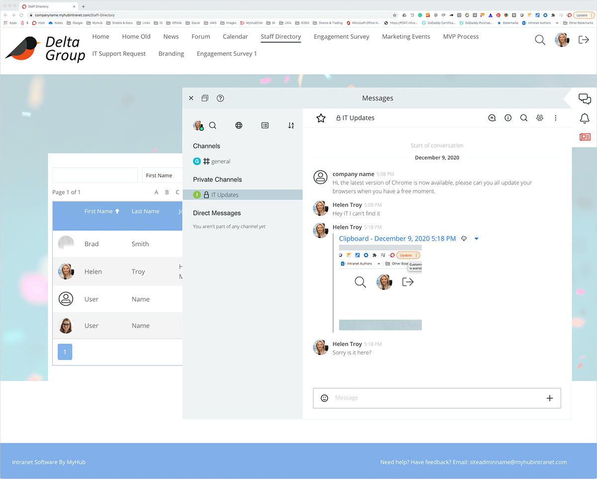
You can set up public or private chats, and employees can send private messages to colleagues or project and team channels. You can also create topic-based conversations using # channels. Furthermore, @mentions and notifications ensure team members are notified immediately of new posts on their favorite channels.
The example below shows who is online and available to chat. You can upload documents, images, or videos for instant sharing. Conversations are automatically stored, and a powerful search makes it easy to locate that vital information when needed.
Fully integrated into your employee intranet and with seamless access to all features, team chat adds value to employee communication.
Main Highlights
-
Support faster decision-making and connect employees with team chat.
-
Chats can be public or private, group or individual.
-
Highlight trending topics and encourage two-way communication with familiar # channels and @ mentions features.
-
Upload files, videos, and images. The search function is available for team chat, making locating just what you need easy.
13. SSO (Single Sign On) Example
The intranet platform offers access to the entire digital workplace. You can easily integrate it with other enterprise systems used by your business. SSO provides gateway entry, so employees only need to log on once to access all tools. MyHub offers 60+ integrations, including Salesforce, BambooHR, MYOB, and HubSpot.
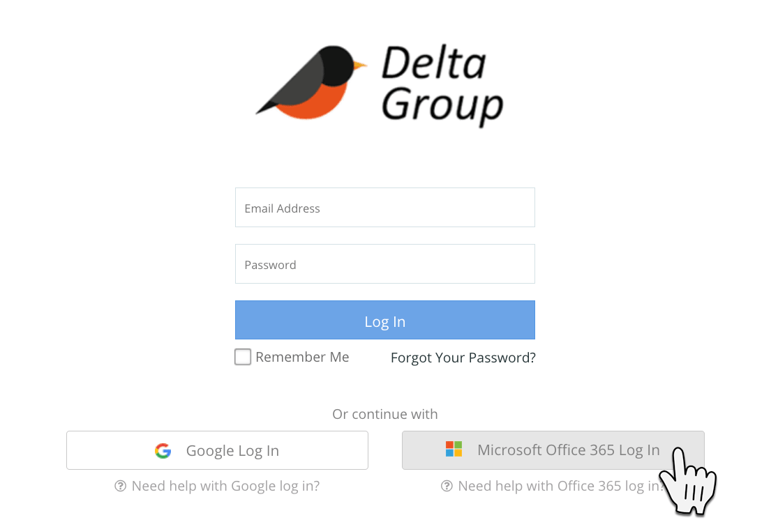
In the example below, workers login using their Google or Microsoft password. Okta SSO simplifies the way users connect. Do away with multiple logins and the need for lots of open screens and apps running simultaneously. SSO is an excellent time-saver and creates a smoother, more coherent user experience.
Main Highlights
-
Simplified one-click login to access digital workplace apps and tools.
-
No need to remember multiple passwords.
-
Better user experience.
-
Central administration of users and credentials.
-
Easily embed assets and have centralized permissions applied.
14. Custom CSS Example
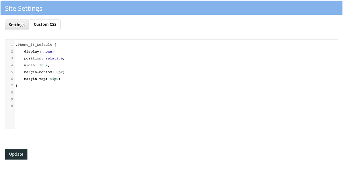
If you want to get really creative with your intranet design, you will love the custom CSS feature. You can easily change the font, colors, margins or layout of one or all of your pages.
The tool is super-easy to use and gives administrators control over the presentation of intranet content.
When it comes to customization, the sky’s the limit with CSS so let your creativity run wild. Check out MyHub’s Resource section for more guidance on the custom CSS feature.
Main Highlights
-
Company intranet administrators will love the endless possibilities for customization CSS makes possible.
-
Simple to use, CSS makes designing your intranet page easy, including colors, fonts, margins, and layout.
-
Provides complete control over your intranet design.
15. Notifications Example
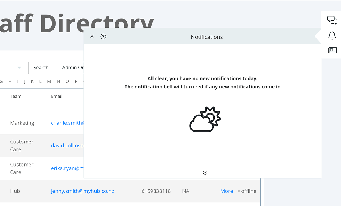
The notifications tool is a handy feature in every employee intranet. Staff use it to keep updated on their favorite # channels and tag colleagues to alert them to important information. You can also check when colleagues have read the notification.
It’s straightforward to use. You can quickly turn notifications on and off, so if you need to concentrate on that vital task, you can do so without any distractions. Simply turn it back on when you are ready.
Main Highlights
-
Ensure staff get all critical updates and company news with targeted notifications.
-
Intranet users can personalize their communication preferences and cut out unnecessary noise.
-
This popular feature improves engagement and empowers employees.
16. Site Map Example
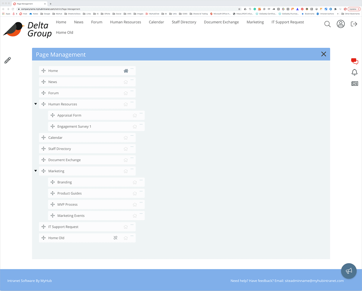
When it comes to managing your company intranet, a simple site map is an essential tool. It provides an overview of the entire site. A high-level picture makes adding pages and editing sections more straightforward. You can also quickly identify duplicate content and rationalize information across the site.
Another critical aspect of intranet management is regularly reviewing content to ensure it’s still relevant and up to date. A site map also simplifies that task.
Site maps are a common feature in the best corporate intranets. They ensure that intranet content is well organized and information flows logically.
Main Highlights
-
Site maps provide an overview of the entire site and assist in the review and management of content.
-
When developing a site map, avoid generic labels like “Other” or “Misc.” Without a clear purpose, these pages become dumping grounds for difficult-to-categorize content.
-
Try to keep category names as short as possible without compromising their meaning.
17. Administration Example
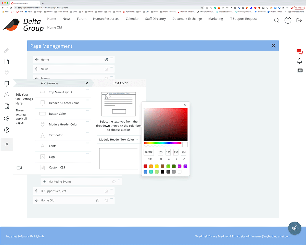
Your new intranet should be easy to set up and simple to use and manage. Here is an administration example taken from a MyHub intranet site.
An easy-to-follow dropdown menu lists the available tools. For example, say you want to change the color scheme to match your new corporate image. All you need to do is select the appearance tab and click on the color you like from the palette. The same simple process applies to changing any page settings.
The admin tool can also add content or edit pages, upload graphics or videos, and add or delete users.
The intuitive intranet solution makes ongoing administration straightforward. Even non-technical staff will find intranet management easy.
Main Highlights
-
Administration tools allow you to edit pages and upload content, videos, or graphics. You can also add or delete users and assign permission rights.
-
Simple, straightforward administration tools are a must.
-
Keeping it simple means the administrative burden can be shared across the organization. Teams are free to manage their own pages.
18. Video Example
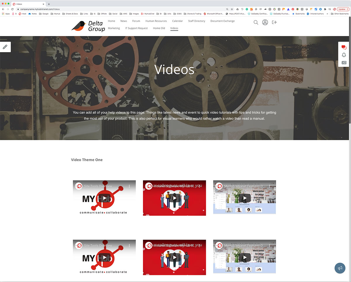
Video is a powerful way to impart information or get corporate messages across. Engaging and low-cost, video is becoming even more important in distributed teams with hybrid and remote workers. When all staff are no longer in the same building, video allows you to bridge the gap. Leaders can still be visible and accessible. And knowledge sharing, training, and onboarding are enhanced with video. For example, an explainer video outlining safety and health policy is far more engaging than a dull, weighty manual.
The best company intranet makes uploading video content easy. Check out this example for ideas on how to use video in your intranet. The possibilities are endless, from quick tips and how-to tutorials to CEO vlogs. Why not encourage user or team-generated video content as part of your employee engagement and collaboration strategy?
Main Highlights
-
Insert YouTube or Vimeo videos directly in your employee intranet. Or create and upload your own videos.
-
Videos are a valuable communication channel for onboarding, knowledge sharing, and training and development.
-
The best video content has a clear focus and is short and sweet. Pack as much information as you can into easily digestible bites.
19. Mobile-First Intranet Example
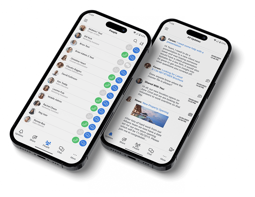
Not every employee has a desk job. However, everyone has a mobile. A dedicated mobile app ensures that on-the-go workers can access all the same fantastic features as their in-office colleagues. Your people remain productive regardless of the location. Even better, they can answer clients’ queries in the field, delivering the superior customer service that drives loyalty.
The following example illustrates the clean, sleek visual interface essential for mobile-first intranets. Employees can access the company calendar feature, people directory, and news feed in a finger-friendly format. Also highlighted is team chat, which is a must-have for service personnel who need to resolve issues quickly in the field.
Your people will love the mobile app, which mimics the look and feel of the social platforms they already use.
Main Highlights
- The mobile app offers various features specifically designed to enhance the user experience.
- Minimalist design is optimized for smartphones and tablets.
- Mobile app users remain connected, informed, and engaged whatever the location.
20. Organization Chart Example
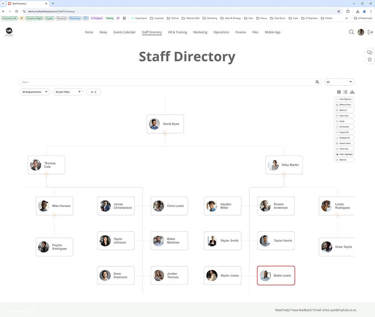
No selection of company intranet examples is complete without an organizational chart. This super-handy tool is essential for new employees and seasoned veterans alike.
In the example below, workers can see where colleagues fit in the company at a glance. The organization chart is searchable by department, job title, or a simple A to Z. Employees can easily reach out and connect with colleagues, making collaboration more straightforward.
Main Highlights
-
Minimalist design is carried through to the logical, easy-to-follow organization chart.
-
Multiple ways to search within the chart.
-
An organization chart is an invaluable onboarding tool for new hires.
21. Integrations Example
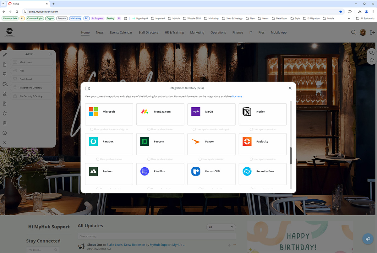
MyHub’s employee intranet software has over 60 integrations to widely used third-party tools and enterprise systems.
Integrated solutions keep employees seamlessly connected. They provide easy, direct access to corporate applications from the employee intranet without needing constant logins. Furthermore, you can synchronize user data with MyHub and automate onboarding processes, ensuring a smooth and hassle-free experience.
This example highlights some of the available integrations. All users need to do is click the icon and follow the simple instructions. Seamless integration is just a few clicks away.
Concerned about data security? There’s no need to worry, as all integrations use enterprise-grade security to safeguard shared data.
Main Highlights
-
Boost productivity with seamless integrations to the software platforms your people use daily.
-
With just a few clicks, you can enable or disable one or multiple integrations in MyHub
-
You can connect integrations for user synchronization, authentication, or both
22. News Example
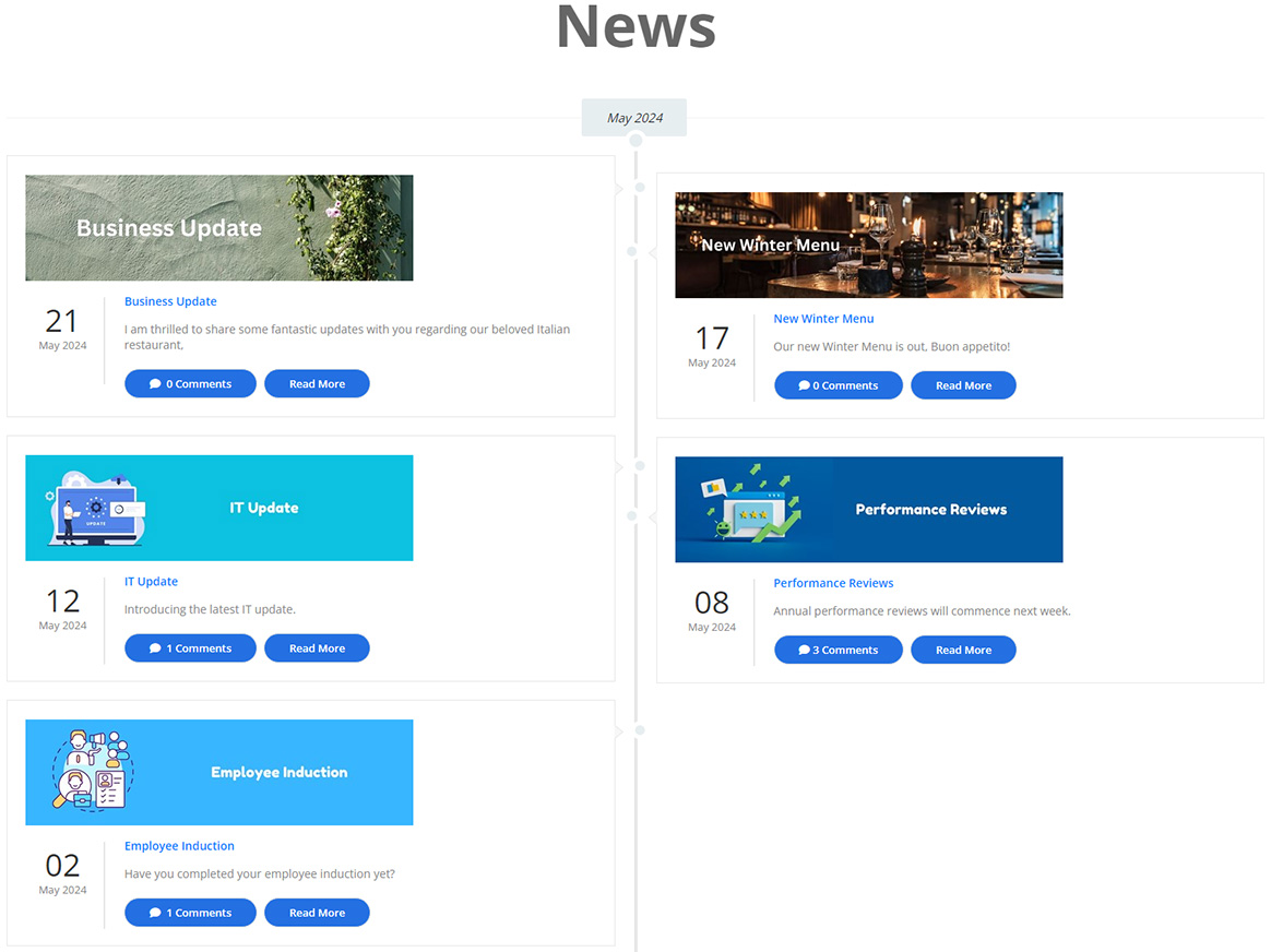
Sharing company news is one of the most popular features of intranet solutions worldwide. However, MyHub’s news page does things differently. Check out the new updates feed below.
This feature pulls together notifications, news, and updates from across the site in personalized feeds. Bright, colorful images motivate employees to dig in. News is presented in bite-sized snippets, with options for more detail. It also includes the social intranet features your people love, such as comments and likes.
Main Highlights
-
News blogs can be sent directly to the updates feed, mobile, or inbox.
-
Incorporate social intranet software features, including likes, comments, and @ mentions to get everyone involved in the conversation.
-
MyHub’s new updates feed pulls together news, notifications, employee recognition shoutouts, and more in one personalized feed.
23. Employee Handbook Example
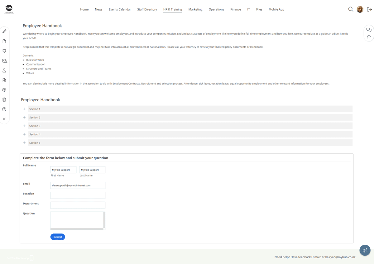
The employee handbook is often one of the most visited resources on the intranet. It includes a wealth of information, from HR policies and processes to information on the company’s core values.
The online employee handbook below breaks down the content into shorter sections, making it easier for employees to find information. Furthermore, keeping the handbook updated is far more straightforward. When a policy changes, HR can update the relevant section rather than the whole handbook.
This example also includes a message box so employees can contact HR directly with any questions or queries.
Main Highlights
-
The online employee handbook is broken up into specific, searchable sections so workers find what they need quickly.
-
Keeping the handbook updated is simple. All admins have to do is update the relevant section rather than the whole handbook.
-
Consider including a message box, so workers can ask in-the-moment questions or provide instant feedback.
24. Events Calendar Example
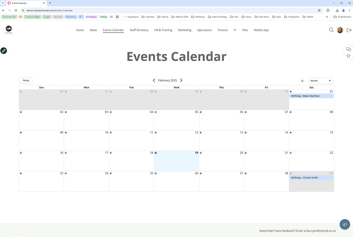
Team or company-wide event calendars are another must-have employee intranet feature. They provide workers wlth a single source of truth for company events and deadlines, helping them coordinate schedules and better manage time.
The example below presents a monthly view. However, you can also select a day or weekly view. Events can be open invites or restricted to specific team members. You can subscribe to other event calendars included on the site and have one central calendar.
Main Highlights
-
Events calendars can be team-based or company-wide.
-
Easily create open invites or restrict participation to selected staff.
-
Subscribe to other event calendars across the intranet.
25. Department Page Example
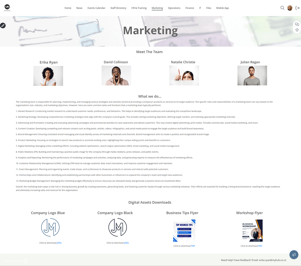
The team or department page is the final entry in our extensive collection of intranet examples.
This example highlights marketing, but it could just as well be finance, HR, or IT. Here, the marketing team uses its page to introduce team members and showcase their work to the wider organization.
Other companies use their department pages to share team-wide news and updates in a mini version of the company intranet.
The intranet’s flexibility and customization options mean you can create departmental pages that suit your organization.
Main Highlights
- Create customizable department intranet pages.
- Highlight internal knowledge, boost collaboration and connect members of the team.
- Incorporate other intranet features, such as events calendar or news feed, and give them a departmental flavor.
Ready to Enhance Collaboration and Engagement with Your Intranet?
Now that you’ve seen the power of various intranet features in action, it’s time to experience them firsthand. Take the next step by experiencing these benefits firsthand with our tailored intranet solution. Sign Up for a Free Trial today!
Intranet Best Practices: Summary Of Findings
Company intranets have existed since the 1990s, and this guide draws on a lot of best-practice evidence.
In this chapter, we shared some of the best intranet site examples to guide and inspire you. Our blog contains more tips and advice on designing your company intranet.
Here’s an overview of the main issues to consider, whether you are planning a new company intranet or updating an existing one.
Intranet Information Architecture
Your corporate intranet will contain a vast amount of company information. The best intranet software organizes this information logically so it is easily accessible.
Intranet information architecture (IA) is critical to success. IA is all about improving the findability and discoverability of content on your modern intranet platform to enhance users’ overall experience.
Here are the best practice trends in IA.
Navigating The Site – Navigation Menu
Site navigation is fundamental to a successful intranet solution. It dictates how users find data within the site. Your intranet will be a wasted opportunity if employees cannot easily and quickly find the information and tools they need.
Some businesses organize the intranet’s content by team or department. This certainly makes ongoing management and maintenance easier. Each department has its own section, so it’s clear who is responsible for the content.
One disadvantage of this approach is that the section headings are often too broad. Furthermore, if there’s an internal restructuring, the intranet must also be reconfigured. This is a time-consuming and labor-intensive process.
As a result, many companies have opted instead for a task-based approach to intranet navigation. Category labels like ‘How do I…’ or ‘I need to…’ can improve discoverability. However, these can also quickly become unwieldy with long descriptions.
Whatever method you use for site navigation, here are the essential things to remember:
-
Avoid confusing and unclear category labels.
-
Make sure users can navigate without hesitation. Use specific, distinct category descriptions that clarify what content is included.
-
Keep it simple and avoid using jargon or technical language. Frontline workers or colleagues in other groups may not readily understand a standard term in your job role or team.
Intranet Site Map
We touched on this briefly in chapter five. A site map identifies the overall structure of your company intranet site.
To get started on your site map, gather together a small group of internal stakeholders and a whiteboard. Select a cross-section of employees from different parts of the organization or from the intranet steering group.
The aim here is for the stakeholders to identify the intranet’s essential parent or main pages along with the child or sub-pages.
Let’s use the HR department to illustrate how to put together a site map. HR will have a parent page, the gateway to all HR information and data. Child pages might include vacation requests, performance management, wellness initiatives, employee benefits, and so on.
Follow the same process for other departments and any centralized data all employee groups need to access.
If you use a topic or task-based approach to site navigation, stakeholders should identify clear section labels.
The site map has to make sense in the organization’s context. Ideally, navigating to the most essential information should be possible without searching. And remember, each parent and child page should solve a business problem or pain point.
Once identified, parent pages are usually presented as mega-menus in the intranet site architecture. These mega-menus, in turn, provide drop-down access to the lower-level or child pages.
However, be careful not to overdo the number of child pages. You don’t want your intranet platform to be like those annoying automated phone systems where you must select from a series of menus before resolving your issue. Keep the navigation intuitive and straightforward to avoid a frustrating user experience.
And remember, lots of content will be shared across all teams. Standard menus, overarching news items, and CEO messages often have a bonding, unifying effect on the workforce.
Wayfinding
Wayfinding helps users navigate the company intranet. Graphic or text clues ensure employees understand where they are on the site and how pages are connected.
For example, wayfinding cues highlight where the user is in the main navigation. Breadcrumbs, as they are called, then identify where the page fits in the intranet information architecture. Furthermore, breadcrumbs can also be used to provide one-click access to higher-level parts of the site.
Quick Links
As navigational shortcuts, quick links provide easy access to popular content and tools. Quick links are a big time saver for users. They’re also a helpful way to highlight new features and content. Frequently used quick links include the following:
-
Most viewed
-
Hot news
-
Most popular forms
-
Trending #tags
-
Top stories
-
Updates feed
Some intranet designers provide customizable quick link lists. With modern intranet solutions, employees can personalize their shortcut links to their own preferences and needs.
Page Access
While drawing up your site map, it’s a good idea to consider any appropriate page permission restrictions.
Given the sensitive nature of some intranet information, several pages will likely need to be secure. Page permissions restrict who can create and edit content and can also limit access to pages. This means only those employees who need to can view the page. For example, Ben in Marketing should not be able to access private payroll information. Site page permissions can be set by job title, department, or location.
Thinking about these issues at this early planning stage will save you time and hassle down the line.
Mobile Access
The standard 9-to-5 office worker is fast becoming a thing of the past. Remote and hybrid working have exploded since the pandemic. Furthermore, there are now more flexible working arrangements, including freelancers and those in non-desk roles. More users than ever are navigating intranets from smartphones and tablets.
In today’s digital workplace, intranet platforms have to be optimized for mobiles. Test the design before going live and ensure the navigation area fits the screen for landscape and portrait viewing.
Better still, consider developing a specialized mobile-first app.
Intranet Pages On-Page Navigation
We tend to read from left to right when scanning information online. Therefore, it’s a good idea to put all the vital information on the left-hand side of the intranet page.
Columns are a great way to present content. However, make sure you use the appropriate column width for the information. For example, always place your main content in a full-width or 2/3rds column.
Less important content, such as hyperlinks and social media feeds, works well in narrower columns on the right-hand side.
Also, remember how the columns flow on smartphones, including which display first. Always test it on a mobile device beforehand if you can.
Intranet Homepage Should Pack A Punch
First impressions really do count. The company intranet homepage sets the standard for your whole site. An attention-grabbing homepage draws users in, so make sure yours packs a punch.
Why not use a colorful visual to grab users’ attention? Incorporate your company branding, logo, and fonts so the intranet software is instantly recognizable to employees. While the intranet doesn’t have to be a carbon copy of your public-facing website, it makes sense to have some cross-over.
Regularly refresh the homepage. Static, unchanging content is boring and quickly becomes disengaging.
It’s also a good idea to set up your quick links on the corporate intranet homepage to make it easy for the user.
Images And Visual Appeal
A text-heavy intranet makes for a dull and uninspiring user experience.
Diagrams, photos, images, and infographics are all valuable ways to add visual appeal to your site. Try to avoid using pictures sourced from the web. Instead, include photos of workers or situations and settings relevant to your employees to drive intranet adoption. This will boost employee engagement and ensure the intranet software is more relevant.
The Six, Six Rule
If you create too many intranet pages, you risk the site becoming overly complex. Not only will the intranet solution be cumbersome to use, but it will also be challenging to navigate.
Try to design the intranet with the six, six rule in mind: a maximum of six pages with six content items on each page. Following this rule also helps you focus on what’s really important.
It should be obvious what the problems or pain points each page is resolving. You should head back to first base if it’s not readily apparent.
White Space
Add white space to your design to break up the text and present a minimalist look.
Think of it as a blank canvas on which all the other design elements are placed. Far from being wasted space, white space presents a clean, uncluttered feel to the company intranet.
Hyperlinks
Best practice suggests you should be economical with hyperlinks to documents.
Too many hyperlinks on one page can be distracting for the user. Instead, consider breaking the links up into logical sections using expanding and collapsing content areas with specific subheadings.
Here’s an example: sub-heading Travel Policies > Hotel Expenses (hyperlink). And make sure you mix things up. Instead of always using text hyperlinks (for example, click here), think about using images that act as links. This is often more obvious to the user and makes for a more engaging employee experience.
Specific Headings Produce Meaningful Search Results
Page, section, and content headings need to be specific and relevant. It’s a balancing act between providing sufficient detail to return meaningful search results and keeping it short enough for scan reading. All navigation categories should be logical and unambiguous.
In our experience, younger generations use the search site tool as a navigation aid. However, older generations tend to navigate through the pages to find the information they are looking for. And that’s why accurate, descriptive headings are so important.
Consistency
Your content should be consistent in style and presentation, especially fonts and font sizes. Try not to fall into the trap of copying and pasting directly into the employee intranet without adjusting the font. Otherwise, you will end up with an unprofessional, inconsistent look and feel that confuses users. It’s well worth investing the time and effort to make sure the company intranet has a consistent presentation.
Banners
Page header images and banners at the top of each page are a great design feature. Visually engaging, they welcome users to the page. They can also be used to showcase features and tools within the page.
File Sizes For Web And Mobile
Large files often take a long time to download when accessed via mobiles. There’s nothing more annoying than the browser whirring around as it struggles to download a graphic or video. That high-res, glossy sales brochure may not be viable for your sales reps on the road.
Instead, pick a format that works well on both the web and mobiles. JPEGs or PNGs are the best choices. And if you are using lots of videos on your company intranet, upload them first to YouTube. You can then embed the video in an iframe or widget on your intranet. That way, you can be sure that users can access the footage, whether from a desktop or mobile.
Custom Integrations
One of the intranet’s main advantages is the potential for custom integration with other enterprise systems. These might be leading HR systems or CRM software like Salesforce, Microsoft 365, Google Workspace, or Dropbox.
Custom integrations mean employees don’t waste time switching between different platforms and logins. The corporate intranet simplifies access and makes it easier to share data and information across these platforms.
It’s also possible to embed hyperlinks or iframes directly in the intranet. This is a good option for frequently used sites or external systems that don’t need full integration, such as real-time NASDAQ data.
Content Contributors
No doubt, you will have several intranet content creators and editors identified across the organization. These contributors may be based on job, department, or location. Whatever the case, develop branding guidelines to ensure that all-important consistency and uniformity to your company intranet presentation.
Ready To Get Started?
What’s Included In This Intranet Design Guide
Intranet Design Articles
Cloud Intranets For Nonprofits Make A Real Difference
Nonprofits excel at reaching external audiences but often struggle with internal communication and outdated systems. In a digital-first world, cloud intranet software offers a practical way to modernize operations while staying mission-focused and budget-conscious.
A cloud-based intranet improves internal communication, streamlines workflows, and supports collaboration through tools like shared calendars, permission-based access, discussion forums, and mobile accessibility. This helps staff and volunteers stay connected and informed—no matter where they are.
Beyond efficiency, cloud intranets boost engagement, morale, and retention while offering cost-effective, scalable solutions tailored to nonprofit needs. It’s a smart step for organizations looking to stay agile and impactful in a fast-changing sector.
Cloud-Based Intranet vs. Company Network: Which is Right for Your Business?
When choosing between a cloud-based intranet and an internally hosted one, it’s important to consider your company’s specific needs, including cost, physical space, and IT resources. Cloud-based intranets require no on-site servers and usually come with lower upfront costs and built-in support, making them ideal for businesses looking for a quick and scalable solution. In contrast, in-house intranets offer more control but demand more maintenance, physical space, and dedicated staff.
Cloud intranets also offer greater accessibility and mobility for remote workers, ensuring employees can log in from anywhere and even during office outages. They often include better document search and organization features compared to typical cloud file storage services like Dropbox or Google Drive, allowing for smoother workflows and more efficient information retrieval.
Security and support are key benefits of cloud intranets as providers handle system protection and troubleshooting. While on-premises intranets give companies full control over deployment and customization, they require internal expertise and greater investment in long-term upkeep. Ultimately, cloud-based intranets offer a more practical solution for many modern businesses needing flexibility and ease of use.
Avoid The Chaos – Introduce Employee Intranet Forum Terms of Use
Clear terms of use are essential for maintaining order and professionalism in internal intranet forums. Without them, discussions can quickly become confusing, disruptive, or even unsafe. This post introduces a downloadable template that organizations can use to establish guidelines for appropriate forum behavior.
The terms cover everything from respectful communication and banned content to moderation rules and how to report issues. Users are expected to avoid things like advertising, personal info sharing, and offensive or illegal content. Moderators have the final say on disputes, and all users must follow their decisions without public challenges.
Having clear forum guidelines not only prevents chaos but also supports digital transformation efforts. It helps create a secure and engaging space for collaboration, reduces misunderstandings, and encourages positive participation across the company.
How to Overcome Idea Hoarding: Why Employees Keep Ideas to Themselves
In today’s competitive business world, organizations often overlook a valuable resource sitting right under their noses—employee ideas. Whether it's a more efficient process, a new product concept, or a creative solution to an ongoing challenge, employees can be a...
13 Tips for Seamless Collaboration Between Remote and On-Site Teams
Our Guest Author Ryan Robinson Ryan Robinson. I'm a blogger, podcaster, and (recovering) side project addict who teaches 500,000 monthly readers how to start a blog and grow a profitable side business at ryrob.com. The modern workplace has changed significantly. Many...
The Complete Intranet Design Guide: All You Need To Know In One Concise Resource
I wrote The Complete Intranet Design Guide to provide a concise, practical resource for anyone tackling intranet design. With so many aspects to consider, I wanted to create a straightforward guide offering actionable insights to help teams build or optimize their...
